
Accessing Interface Config Info
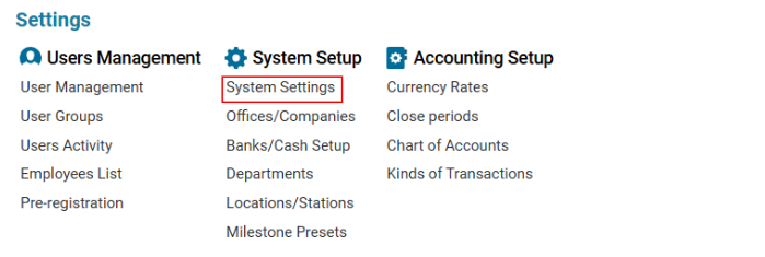
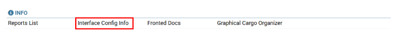
Navigate to the Settings section and under the System Setup Section click the “System Settings” Button. Then under the INFO Section click the “Interface Config Info" button.
Overview
The Interface Config Info page provides a structured view of system components and their configurations. This section allows users to explore different components and their corresponding settings, including field properties, column formatting, and permissions.
Features
-
Component Selection:
-
The left panel displays a list of available system components.
-
Users can search for a specific component using the Q. Search bar.
-
-
Configuration Details:
-
The right panel displays the detailed JSON-based configuration of the selected component.
-
Information includes field types, display styles, permissions, icons, and formatting rules.
-
-
Field Attributes:
-
Each component consists of multiple columns, each with specific properties such as:
-
Field Type (e.g., icon, text)
-
Header Name
-
Tooltip Descriptions
-
Field Width & Style
-
Conditional Formatting (e.g., icons based on values)
-
-
How to Use the Interface Config Info Page
-
Search or Select a Component:
-
Use the search bar to find a specific component.
-
Click on the component name to load its configuration.
-
-
Review the Configuration:
-
The right panel will display the JSON structure of the component.
-
Identify key attributes such as field names, data types, styles, and permissions.
-
-
Interpret Conditional Formatting:
-
Some fields have conditional styling rules (e.g., color codes, icons based on values).
-
Example: A green checkmark (fa-check) appears when a certain field is set to 1.
-
-
Modify Settings (Admin Use Only):
-
Advanced users can edit these settings via the system backend to customize the interface.
-
Example Configuration Breakdown
json
CopyEdit
{
"field": "posted",
"type": "icon",
"header": "PSTD",
"fieldTooltip": "Posted",
"fieldStyle": "text-align:center;",
"headerStyle": "text-align:center;",
"width": "42px",
"formula": [
{
"sign": "=",
"field": "posted",
"value": "1",
"style": "color: #2f9900",
"text": "fa-sharp fa-solid fa-check"
}
],
"editable": true
}
-
Field Name: posted
-
Type: Icon
-
Header Label: PSTD
-
Tooltip: Displays "Posted" when hovered
-
Alignment: Centered
-
Width: 42px
-
Conditional Icon:
-
If posted = 1, show a green checkmark (fa-check)
-
Key Benefits
✅ Easy Navigation: Quickly search and browse through interface components.
✅ Structured Data View: Understand the configuration of system elements in JSON format.
✅ Customization Possibilities: Modify styles, tooltips, and permissions for an optimized user experience.
✅ Real-time Analysis: Identify and troubleshoot interface behavior by reviewing configurations.